Bringing Corporate Data to Life
Case study written October 2012.
Contents
Background
Project Background and Context
The University first established a Management Information System (MIS) in 2001 to complement the implementation of a new student record system (SITS). Data is extracted from SITS and stored in a data warehouse, initially making use of OLAP technology to build a series of cubes (3 dimensional models) for specific applications such as admissions and enrolment. After initially experimenting with Microsoft Excel pivot table services, we eventually selected a reporting tool called ProClarity which allowed us to display data using a range of grids, line, bar and pie charts. Over the following decade, the data warehouse has grown and we've developed a wide range of core applications reporting on essential business processes such as student enrolments, admissions (including clearing), school performance data, DLHE as well as providing the data for inclusion in the HESES return.
However, as the range of applications has grown and the number of dedicated reports has escalated, MIS has become more difficult to use effectively for decision-makers. As a consequence, there was evidence of fewer operational managers using MIS on a regular basis to interrogate data coupled with a significant increase in the number of data requests passed to IT Corporate Systems who are responsible for maintaining MIS. The introduction of a new Vice-Chancellor and senior management team expressed the desire to make greater use of dashboards for decision-making, a feature that was not supported in Pro-Clarity and which was unlikely to be developed since Microsoft purchased the reporting software.
Consequently, IT Corporate Systems at UEL decided to review the business intelligence market during the summer of 2010 and after analysis of a range of products and advice from Gartner, we selected QlikView as our preferred option. This is an in-memory tool which allows for the rapid development and deployment of BI applications and provides us with the capacity to develop dashboards. Within 7-10 working days, we had built a demonstrator model which included three components (student enrolments and admissions, a prototype benchmarking application examining local HE participation as well as a financial profile of the HE sector). After demonstrating our prototype models to the University Management Team, they agreed to fund the procurement of the QlikView Enterprise Server and an appropriate number of licences.
Aims & Objectives
The overall aim of the project is to significantly upgrade the business intelligence capacity of the University of East London. It is intended to provide managers with access to a much broader range of information than has previously been available with our existing management information system and consequently, allow us to enhance our strategic planning processes. The project has developed three BI applications (Student Lifecycle, Benchmarking and Corporate Performance) making use of the significant advances in software tools that utilise in-memory technologies. Information in each application is presented using a range of fully interactive dashboards, scorecards and charts with filtering, search and drill-down and drill-up capabilities. In addition, we have made extensive use of Google maps to analyse student recruitment, application and employment patterns. To assist managers in selecting, extracting and interpreting data views, metadata has been provided to inform users of the purpose of the data, its source and how often it is updated.
The three applications have been deployed to senior staff and managers over the length of the project and delivered via our intranet and as well as through mobile devices such as the iPad. Managers have been engaged throughout the project in terms of how information is presented, the design of dashboards and the identification of additional sources of data.
Key Drivers
Given the challenging external environment in which higher education now operates, it is imperative that HEIs respond quickly to a rapidly changing sector. The significant policy changes implemented by the current government mean that HEIs such as UEL have to be more proactive in their decision-making, particularly in terms of recruiting and retaining students in a increasingly competitive sector. Providing managers with timely business intelligence in a highly digestible form will mean that strategic decision-making can be made quickly and remedial actions put in place.
Project Approach
The project comprised 6 workplans, the three most significant of which related to the development of the Student Lifecycle, Corporate Performance and Benchmarking applications. The remaining workpackages related to overall project management, testing and evaluation and production of reports. The project is managed by a project team consisting of members from IT Corporate Systems and Strategic Planning with significant input from colleagues in Admissions, Student Records, Quality Assurance, Finance, Post-18 Schools and College team, Corporate Marketing and managers from academic schools. The specifications for the dashboards were based on user requirements but primarily informed by the previous experiences of the project team. A range of prototype dashboards were developed, tested by the relevant operational managers and once approved, added to the overall Student Lifecycle application for later deployment. A similar cycle of feedback and evaluation took place in developing the Benchmarking and Corporate Performance applications. Deployment of the final versions of the three BI applications coincided with training on a small group or one-to-one basis. We also received feedback from users once the applications were in use, particularly in terms of additional content and functionality. The most recent deployment of the Student Lifecycle application (v2.1.8) in August 2012 implemented recommendations in terms of producing video training guides and improvements to the module and DLHE components as well as incorporating data validation checks.
Scope
Although the project aimed to develop three separate BI applications, there is a clear overlap between components of all three. The purpose of the benchmarking application is not to be a standalone product, but rather to be linked to the other applications and allow managers to assess institutional performance against competitors and peer groups. Much of the data in the benchmarking application provides a time-series context when looking at the institutional data held in the Student Lifecycle and Corporate Performance applications. For example, when looking at current enrolment data in the Student Lifecycle app, the user can look at time-series patterns in the Benchmarking application to assess how we are performing compared to competitor institutions. Ultimately, the University intends to use QlikView to report on all its operational systems, including human resources as well as attendance and timetabling which are outside the remit of this project.
Technologies and Standards used
Oracle SQL(Enterprise Edition) v10
Oracle PL/SQL
Toad for Oracle xpert v10.0.0.41
QlikView Ajax zero footprint client v10.4
QlikView Enterprise Server v10.4
QlikView named user CAL (developer client) v10
Microsoft Excel 2007
The Oracle SQL, PL\SQL and Toad are used for programming and extracting data from our SITS student record system and storing the data extracts in the data warehouse. Data is extracted most typically weekly, frequently daily during busy periods and monthly for components such as the DLHE. The QlikView Enterprise server is used to store and distribute BI applications to users as well as controlling access and security. Applications are accessed through a Ajax zero footprint web-based client and the QlikView developer client links to our data warehouse through a ODBC link as well as allowing us to import data from other external sources such as Microsoft Excel. In addition, the developer client allows us to design dashboards and produce relevant reports making use of the graphic features included in the product in a highly visual way. We have also made extensive use of Microsoft Excel, particularly in terms of extracting data from HEIDI and loading it into QlikView for development and deployment.
Governance
We established a dedicated project team co-ordinated by the project manager. The project team meets monthly to review progress against the activities outlined in the six work packages, identify potential obstacles and challenges, provide feedback to the technical and project manager as well as manage communications across the institution. During the initial phase of the project, the project team reported to a steering group consisting of a group of selected managers and chaired by the Director of Information Services. As a result of changes in the structure of the senior management at the University, the project now reports to the Data Quality Board chaired by the Deputy Vice Chancellor, largely consisting of senior operational managers.
Senior Management buy-in
Improvements to our business intelligence capabilities emerged from the appointment of a new Vice-Chancellor and senior management team. They wished to implement corporate level dashboards for monitoring performance and for reporting to Governors. As a result, we have had their support throughout the project, taken on board feedback from senior managers and implemented these into the development of our BI applications. The Student Lifecycle and components of the Benchmarking applications have been distributed to the senior management team and data extracted from these have already been used for example, in a comparative assessment of the results from the 2011 National Student Survey.
Outcomes
Development of Student Lifecycle application
Before commencing work on the Student Lifecycle application, the project team established a series of underlying principles for development by which progress and achievement could be measured. The first and most important of these was to integrate a wide range of student data into our Student Lifecycle application, thereby replacing at least 40-45 separate reports that users need to interrogate to obtain the same level of data coverage. Integration meant that users could access the latest student data on applications, enrolments, student characteristics, module results, awards, student retention and employability from one application.
The second principle was to try to present what are often quite complex datasets in a visually interesting and unambiguous way, so that users can immediately grasp what the data is indicating. Previous experience of deploying BI applications suggested that supplying users with metadata that informs users of the purpose of the data, its source and how often it is updated would be beneficial coupled with video training guides as an aide-memoire to supplement our training programme. The video training guides are currently stored on the UEL Wiki as this allows us to play them in higher definition. However, for dissemination and portability purposes, we have set up a UELBI channel on YouTube which can be accessed here: http://www.youtube.com/user/UELBIProject/videos
The screenshot below shows the ‘How to’ tab and users access Meta Data and Video Training Guides by clicking on the coloured buttons as well as an indication of the latest extract dates.

The third key principle was to recognise the different needs of users ranging from the more casual enquiry through to power users who need to access and interrogate student data on a daily basis. To facilitate this, we designed separate tabs for corporate level dashboard as well as separate tab that allowed the more advanced, analytical user to interrogate the data using drill-down and drill-up functionality. The tabs are colour coded to reflect the different student lifecycle functions and datasets (i.e. Admissions, Enrolment, Module Results, etc) and any selections made using list boxes or drill-down functionality are only reflected in that colour-coded tab.
Student Lifecycle Design & Content
One of the objectives of the project is to allow users to interrogate and analyse student data in a range of different ways. We have made extensive use of the dashboard functionality and graphic capabilities of QlikView and set out from the outset to make it significantly different in design terms from our previous MIS, which largely portrayed data in grids and could often be quite difficult to interpret. After some trial and error in using different types of objects to display specific data, we have largely settled on using dials to display data against targets or benchmarks, Google maps to spatially examine admissions, enrolment and employment patterns in data as well as range of line, pie, doughnuts and grids to undertake more detailed drill-down analysis. In addition, we have been able to make use of 'slider' objects which for the first time have allowed us to develop an interactive student tracking and retention model that allows us to track progression on a course/programme over the a number of academic years.
Presented below are a selection of screenshots extracted from the Student Lifecycle application developed in QlikView. The functions include dashboards on Student Admissions including mapping, Student Enrolments, Student Profile and Module Results.
Student Lifecycle - Admissions data
The purpose of the admissions dashboard is to give managers a relatively unambiguous view of the current institutional position in terms of applications. The two dials in the lower part of the dashboard present the number and proportion of current applications compared to the same point last year. This is made possible because of the 'time stamping' of weekly data extracted from SITS and stored in our data warehouse. The 'test tubes' in the upper part of the dashboard break down current applications in terms of the type of offer made (Unconditional or Conditional) or whether the application is still being processed or rejected. The red line in the test tube represents the position at the same time last year and the blue fill indicates the current position. Users can select from a range of list boxes and the dials and test tubes will change according to the selection. In the screenshot below the dashboard, we present the same data using the type of grid we were using previously in MIS.
Student Lifecycle - Admissions Dashboard replaces the grid below


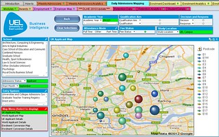
Student Lifecycle - Admissions Mapping
As well as examining admissions data using dashboards, we can examine the origin of applications using Google Maps. Users can look at applicant data using a map of the UK, a map of the World or alternatively, view the conversion rates of applicants to enrolments spatially. The screenshot below shows the current number of applicants from East London postcodes with the size of the dot representing the respective number of applicants.
At the national level, users can click on the largest dots and drill-down to the next spatial level. To obtain the number of applications, users can either place the cursor over the dot or alternatively, select 'UK Applicant Details' from the Map Menu list box and a grid will replace the map with a count of applications by postcode that can be exported to Excel.

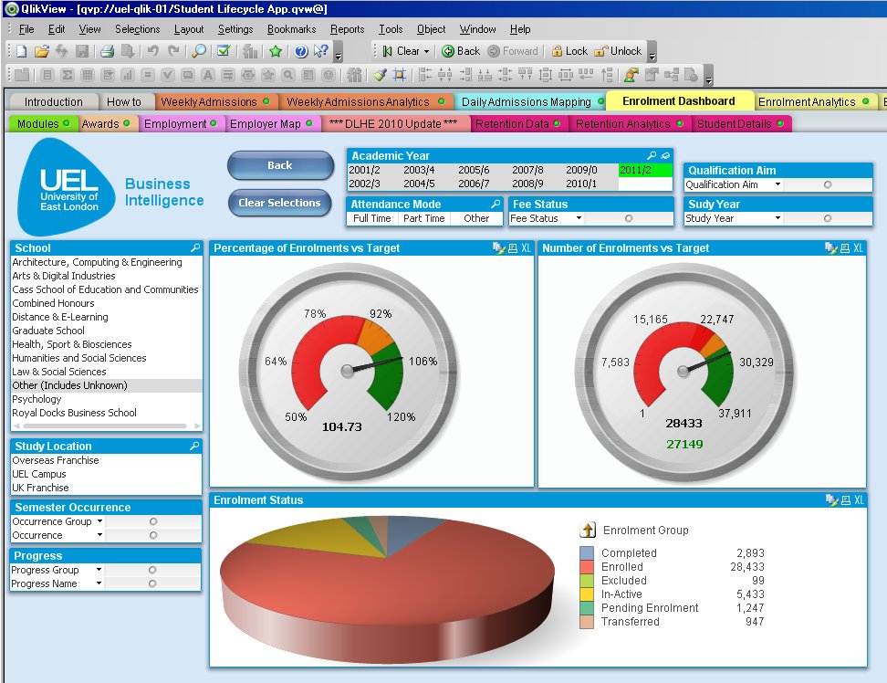
Student Lifecycle - Enrolments
The purpose of the enrolment dashboard is to provide managers with a quick and visual confirmation of current enrolments compared to targets. Similar to the admissions dashboard, users can select from the list boxes and examine the how the dials change. This is particularly useful for analysing student enrolments by school and by attendance mode and fee status. The top two dials examine current enrolments against target in terms of student numbers and percentage against target. The traffic lights indicating progress are an easy indication of the current position and can be set within the object by the developers. The pie chart at the bottom of the dashboard provide a breakdown by enrolment status and gives an indication of the number of students who may have completed their programme, currently enrolled students as well as those that have either withdrawn or currently intermitting. This object also allows the user to drill-down for further analysis.
Student Lifecycle - Student Profile
Similar to a number of HEIs, UEL has had a longstanding record of traditionally widening access to under-represented groups. The dashboard below provides a snapshot of our student intake with regard to ethnicity, age, gender and entry qualifications. Similar to the other dashboards, users can select from a range of list boxes and examine the impact on student characteristics. In addition, users can drill-down on any of the four objects to a lower level and examine the effects. For example, if the user selects Asian from ethnicity, this will change to look at the respective numbers from Bangladeshi, Chinese, Indian, Pakistani and Other Asian ethnicity as well as changing the remaining three objects to reflect the characteristics of Asian students. In addition, during initial deployment and training, some users found the plethora of entry qualifications confusing in terms of levels. To assist users, clicking on the blue 'Entry Qualification Framework Document' provides a classification of entry qualifications by level.

Student Lifecycle - Module Results
The function of the module results dashboard is to allow academic staff members to assess module performance in terms of pass rate, average mark and standard deviation. Similar to other dashboards, users can select from a range of list boxes, particularly in terms of the module level, the current attempt and the academic school. The view presented below is for all module results studied in the 2010/11 academic year and users typically will select a school from the module drill table and select their respective module. This will then provide an analysis of module pass rate (%), average module mark and standard deviation. For validation purposes, the user can select student details which provide the module mark for an individual student in conjunction with assessment decision.

Deployment of Student Lifecycle application
The Student Lifecycle application (currently v2.1.8) is deployed to approximately 90 staff, mostly senior managers and operational managers in schools and services. We are currently running this application alongside our long-running MIS and from next year we will phase this out and transfer the 150-200 ProClarity users over to QlikView. We are currently releasing updates to the Student Lifecycle application on a quarterly basis as a result of feedback from colleagues, mostly as a result of additional content and design changes. Feedback from colleagues suggests that those staff who have made extensive use of our previous MIS have found QlikView to be significantly easier to manipulate and extract data, particularly in terms of supplying senior managers with data and analysis.
Development of Benchmarking application
One of the objectives of developing a Benchmarking application is to make staff aware of the range and quality of contextual data available and how it can be utilised to contextualise institutional performance. The university has regularly made use of benchmarking data, often for very specific purposes. We have frequently extracted data from UCAS and HESA (via HEIDI) for benchmarking institutional performance against competitor groups. However, the detailed analysis of benchmarking data has often been sporadic and we haven't consistently made use of the wide range of data available. Frequently, we've contracted external organisations to carry out benchmarking studies as well as purchasing benchmarking data from different agencies for a very specific purpose and which after use has been stored on staff pc's and not made available for other analysts. One of the design principles we employed in developing a benchmarking application was to provide a link to the Student Lifecycle and Corporate Performance applications so as to provide a sector-wide and time-series context for current performance data. For example, when looking at the proportion of First Class or Upper Second Class degrees in the Student Lifecycle app, the user can look at respective proportions and time-series patterns in the Benchmarking application to assess how we are performing compared to peer institutions.
Benchmarking Content
We have made extensive use of the data contained in HEIDI, although we have found it not to be as user-friendly as it should be. Although it contains a wide range of data, extracting it can be difficult simply because the way the data is stored. As a consequence, formatting data can take some time and we have recently developed a series of Macros that has significantly reduced the time taken. Initial development of the benchmarking application focused on building the individual components in separate applications based on the particular data set. Typically, these would contain a greater level of detail and are primarily aimed at colleagues in our Strategic Planning team for conducting detailed analytical studies. For the more causal user, we have integrated the following Benchmarking components into one overall application and have added metadata and video training guides. This integrated application contains in excess of 2.4 million rows of data and features the following data sets:
- Awards
- Employability (DLHE)
- HEFCE performance indicators
- Staff : Student Ratios
- Staff
- Admissions (UCAS & GTTR)
- Student data
- Financial health
- National Student Survey
- Local HE participation in collaboration with London Borough of Newham
- Long-term HE participation in the Thames Gateway
Similar to our Student Lifecycle application, the video training guides are currently stored on the UEL Wiki as this allows us to play them in higher definition. However, for dissemination and portability purposes, we have uploaded them to our UELBI channel on YouTube which can be accessed here: http://www.youtube.com/user/UELBIProject/videos
Benchmarking Design
During initial project team meetings, one of the main challenges was to identify how best to compare performance across institutions. It became clear that benchmarking against similar type of HEIs was a pre-requisite as well as the location of the HEI. However, identifying the peer group that UEL wished to be compared against proved more problematic as it became apparent that stakeholders had differing views of the institutions they wish to be benchmarked against. As a consequence, we settled on allowing users to select any institution or cluster of HEIs that they wished to benchmark against, rather than hard-coding at least 5 different peer groups.
The design of the Benchmarking application evolved over time as we gained increased familiarity with the objects and elements contained in QlikView. We have now settled on a consistent design and approach and in particular, have made extensive use of containers. These allow us to package different data views into one object, thereby reducing the number of tabs required in the application. Given the range and quantity of data held in the varying benchmarking components, this has been a valuable way of reducing the number of data views into more user-friendly formats. For the integrated Benchmarking application, we elected to show each dataset on one tab. If we had attempted to integrate every tab of the individual Benchmarking components, it would have meant 55 separate tabs and we decided consequently, to select the most useful data for this integrated application and restrict to one tab for each component.
Benchmarking - National Student Survey
The function of the NSS component is to allow users to benchmark institutional responses to the National Student Survey. It allows the user to select an institution and subject and compare responses in terms of the type of institution, the location of the HEI and/or select a range of institutions that comprise your peer group. The example below examines the 22 questions of the NSS for Law students at the University of East London (blue line) and benchmarks against post-92 former polytechnics located in London consisting of nine institutions (red line). The spider chart shown below is only one way of analysing the data. For more detailed analysis, users can interrogate the larger NSS component which features twelve different reports, a number of which are formatted as tables and which have been used to populate a recent report.

Benchmarking - Awards
The purpose of the award module is to provide users with the capacity to benchmark degree classifications by institution and subject. Similar to the NSS function, users can select an institution and benchmark against the type and location of an institution as well as select a range of institutions that comprise your peer group. In the screenshot below, degree classifications for graduates studying 'Fine Art' at UEL (blue bars) are compared to post-92 former polytechnics located in London consisting of nine institutions (red line). The data is presented graphically and supplemented by a table that can be exported to Excel for inclusion in paper-based reports.

Benchmarking - DLHE
The Destination of Leavers from Higher Education is a survey of all the employment outcomes of home funded graduates. It is used as one of the key HEFCE performance indicators and can often be found as a contributory component of league tables and will become increasingly important as part of the KIS (Key Information Sets). The purpose of this application is to compare the employment outcomes and characteristics
of graduates in employment or undertaking further study between institutions as well as facilitating benchmarking against the type and location of HEI and/or by peer group. The screenshot shows the employment characteristics of UEL graduates in work and further study and again benchmarks against post-92 former polytechnics located in London.

Benchmarking - Local HE Participation
This application is derived from student data purchased from HESA as part of a collaborative project with the London Borough of Newham. The aim of the project is to examine local participation in HE and in particular, the participation of young Newham residents. The findings of this project has been presented at the HESA\JISC\SUMS Benchmarking event in October and a 37 page report entitled 'The Progression of Newham Young Residents to Higher Education' has been widely circulated. As a consequence, the influential umbrella group London Councils is in the process of investigating whether this research could be extended to all 33 London boroughs. This screenshot shows the five most popular HEIs (market share) for young people resident in Newham.

Development of Corporate Performance application
The project plan indicated that the Corporate Performance application will provide managers with the ability to monitor institutional KPIs and those that emerge from the programme boards responsible for delivering the new corporate plan, staffing and programme costs and the development of a tool for evaluating a range of 'what...if' scenarios. The application has largely delivered this objective although there have been some changes as a result of institutional decision-making. For example, it has been agreed that the staffing component of the Corporate Performance application will be added at a later date and that instead, we will develop a much larger dedicated HR application.
Corporate Performance - Key Performance Indicators
The purpose of this dashboard is to be able to assess school performance on six key performance indicators in an easily digestible format. The six indicators include the level of student satisfaction derived from the National Student Survey, graduate employment derived from the DLHE, student outcomes based on average module mark, research income, proportion of completed Staff Development Reviews and the proportion of income from the recruitment of overseas students. The screenshot shown below is based on archive data from a school that has recently merged with others. If the dial points to a green segment, it means that school performance is above the institutional benchmark and if it points to a red segment, performance is below the institutional benchmark.

Corporate Performance - Research Grants
This component of the Corporate Performance application was not originally included as part of the JISC funded project. However, after discussion with colleagues within our Research and Development Support team, we decided to add this to the overall application. The purpose of this component is to track progress in submitting research and consultancy bids throughout the academic year. The screenshot below indicates the number of bids submitted, application success rate, the cumulative financial value of successful applications and the average value of bids broken down by outcome.

Corporate Performance - Programme Costing
The purpose of the programme costing component is to allow the user to determine the financial viability of developing a new course or programme. Given the lengthy process for validating new programmes and the associated staff costs, it is imperative that those staff members developing a new course are fully aware of the financial implications of validating and delivering a new programme. A course that is unlikely to make a positive financial contribution is unlikely to be given the go-ahead to proceed to validation unless a sufficient business case has been made. The programme costing model is divided into three sections: Income; Expenditure and Results. Income is calculated on the basis of student numbers and are entered using the six slider objects indicating programme year (Years 1-3) and fee status (Home & Overseas). The calculation of total income is based on multiplying student numbers by tuition fee and teaching grant if applicable. Expenditure is calculated on the number of hours required to develop and deliver a new programme as well as student support costs in terms of the provision of bursaries and scholarships. The results are presented graphically in terms of profit/loss and total income/total costs. The two screenshots show two different views of the same model. The full view shows the entire model and users can easily assess the impact by altering the sliders to determine the number of students or alternatively, alter the number of teaching hours required for delivering the new course. For users with smaller monitors, we have developed the same model using containers.
Programme Costing model - Full View

Programme Costing model developed using containers

Current Assessment of Business Intelligence Maturity
The overall aim of the project is to significantly upgrade the business intelligence capacity and to provide managers with access to a much broader range of information. As we have had a management information system in place for several years, we were in a fortunate position in terms of our placing on the BI maturity model at the start of the project. When we started the project, we were effectively located at stage 3 and had started some provisional work on attaining stage 4.
Given the eighteen months since we have started the JISC project, we have completed stage 5 and for a wide range of activities, there is clear evidence of some engagement of strategic use at level 6. The Benchmarking application is now complete and a number of components have been used for strategic decision-making, particularly two internal projects, one of which examined the relationship between module marks and award classifications. Without having this data in such a useable form, it is unlikely we would have been able to progress these projects in a timely manner with the same clarity of purpose or be able to link relatively diverse datasets. As a consequence, we currently estimate our progress to be:
Stage 5 – 100% completion
Stage 6 – Although difficult to currently estimate quantitatively, there is evidence of strategic engagement both internally and externally. Our collaborative project with the London Borough of Newham is a good example of using HE data to inform local policy.
Key lessons learned
Project Management
One of the challenges in delivering the BI project has arisen from balancing the internal and external demands for data with the requirements for this project. Although the project has remained on schedule, a management decision last summer to close our largest, most complex school and redistribute its courses, programmes and modules to four other schools meant that we had to suspend the development and deployment of the Student Lifecycle application until this process was complete. In order to deliver this academic restructuring, significant coding changes were made to the SITS student record system with a knock-on effect on the records contained within the data warehouse. As a consequence, the data warehouse required restructuring and reprocessing as well as the load scripts for input into QlikView. Lessons learnt include:
- Allow more time in the scope of the project to take account of these institutional requirements.
- Manage the project so as to bring forward other components that were scheduled for later development.
Development
As with any project, greater familiarity with the reporting tool led us to develop more efficient ways of importing data either through the data warehouse or from external sources stored in Microsoft Excel. This has been particularly relevant in formatting benchmarking data extracted from HEIDI and led us to develop a range of Macros to format data in a way so as to optimise the data load. Similarly, our techniques in presenting data using 'SET' analysis has evolved over time so we have become far more effective in displaying data in different ways as well as experimenting with a range of objects for presenting data. Responding to user requirements for the explanation of the different data elements led to us providing Metadata and video guides to enable the more casual user to be self-sufficient. Lessons learnt include:
- That the final application deployed will be significantly different from the prototype.
- Can show the data in a range of different ways, some of which are more effective than others. Eventually settled on specific objects for specific data views, i.e. dials to measure progress against targets.
Dissemination Activities
During the initial project planning, we largely envisaged disseminating the applications internally and gaining feedback from UEL operational managers. One of the unexpected outcomes of the project is that we have been able to demonstrate the Student Lifecycle and the Benchmarking application at the QlikView HE user group as well showcasing at the HESA\JISC Benchmarking event and to a range of Danish Universities in Copenhagen. In addition, as a reference site, we have hosted a number of HEIs (QMW, Derby, City, Sunderland, Royal Holloway) and are in the process of scheduling visits for other HEIs. One of the benefits of these events is that we get constructive feedback from other HEI's and often have found this to be more useful than input from internal sources. Lessons learnt include:
- Although feedback from internal managers has been very useful and integrated within the final version of the three applications, the external validation of our BI activities has been particularly beneficial in terms of design and the linking different of data elements.
Staffing
Although the composition of the project team has altered, the core team members have largely stayed intact. Feedback from colleagues undertaking similar projects at other institutions suggests that a range of different staff roles are responsible for developing business intelligence applications. One of the key characteristics of successfully developing BI is the proximity to the data coupled with knowledge of how data is used. Lessons learnt include:
- In implementing our BI project, the core project team require significant technical experience as well as knowledge and expertise in how data is used in the organisation. BI delivered solely as an IT project is less likely to be successful.
Looking ahead
Given the level of investment the University made in procuring QlikView before the JISC BI project began, there was already a level of built-in sustainability. This has been significantly reinforced by the three BI applications we have developed for this project and demonstrations to internal and external audiences have already led to suggestions and requests for developing new applications once the JISC BI project has ended. In addition to maintaining the BI applications we have already deployed, colleagues have requested that we develop a range of additional applications. These are to include:
- Human Resources application - To include data from the Trent HR system, the Stonefish application system as well as the institutional staff survey and performance management system;
- Student Feedback application - Integrate student feedback data from the National Student Survey, International Student Barometer, UEL student feedback survey and results from module feedback surveys;
- Attendance Monitoring & Student Engagement application - Track student attendance via our recently installed CELCAT system, identify level of student engagement and correlate this with student performance;
- Financial Reporting application - Allow budget managers to track spend against budget;
- Estates application - Monitor energy usage and room utilization.
One of the issues that have emerged for the institution from this project is the level of analytical expertise that can take advantage of the BI applications we have developed. One potential area for development could be to establish a 'virtual BI group' based on similar principles to the concept of a Business Intelligence Competency Centre and clustered around and promoting the effective use of corporate data.
Summary and reflection
At the start of the project, we indicated that one of the principal aims of the project was to rapidly develop and deploy a range of integrated business intelligence applications. As a consequence, we deliberately set out a challenging development schedule and we have largely met and exceeded our expectations. The principal reasons for this success to the significant experiences of the project team in developing BI applications over the last decade as well as selecting a reporting tool that can facilitate rapid development and deployment. The time spent before the commencement of the project in reviewing the business intelligence market and selecting the most appropriate reporting tool (QlikView) for our project, has proved to be crucial in delivering the objectives of this JISC project. The flexibility and graphic capabilities in QlikView has meant that we have been able to maximise the value of our data stored in our data warehouse as well as bringing to life a wide range of data held in Excel spreadsheets. Similar to an iceberg, the data visualisation tools in QlikView represents the third that you can see easily see. However, it is the two-thirds underneath this surface, in this case representing the maintenance of the data warehouse in terms of developing and running SQL scripts, data quality checking, etc. that is where much of the work takes place. The lessons we have learned over the previous decade has meant that we have been able to avoid many pitfalls and consequently, rapidly develop new business intelligence applications. If we were to implement a business intelligence solution from scratch, we've estimated that we would require two full-time staff for two years with input from at least six operational managers from the University contributing a day per month for meetings and testing. We would estimate that hardware and software costs would work out at approximately 50% of the staff costs.